Game on State
Several design concepts I worked on at my internship with the team at Touchpoint Design for the client, Game On State. Game On State is a hybrid candy store/arcade on the main shopping street, State Street, in my hometown of Media, PA.
The goal with the logos and brand design was to create something that shows a blend of the candy store and arcade ideas, with a twinge of nostalgic vibes. Included as well is the final brand design that the team settled on, the color scheme and the storefront with the final design.
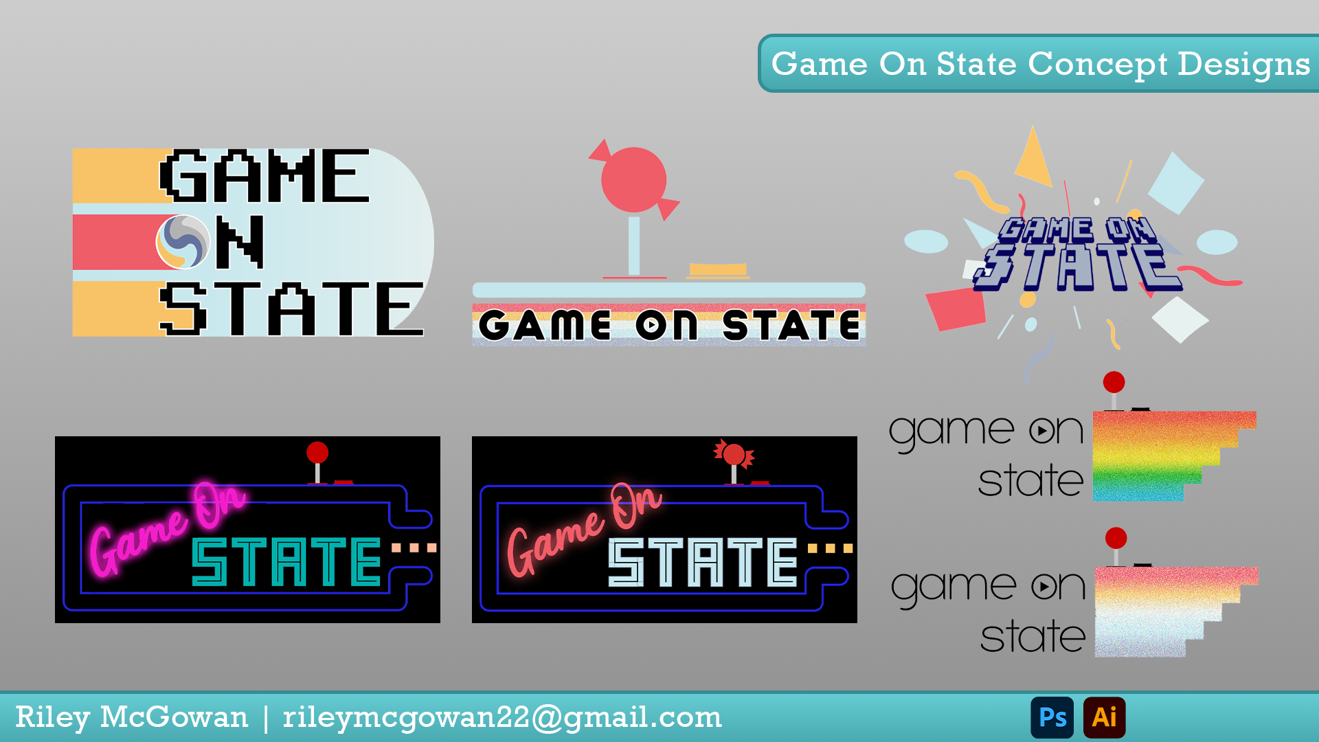
Several designs that I made throughout the process, incorporating the pastel color scheme we wanted to go for with more arcade-esque imagery, such as 8-bit fonts, joysticks and pinballs. Included as well are some more overtly 80s/neon designs that I was particularly proud of.
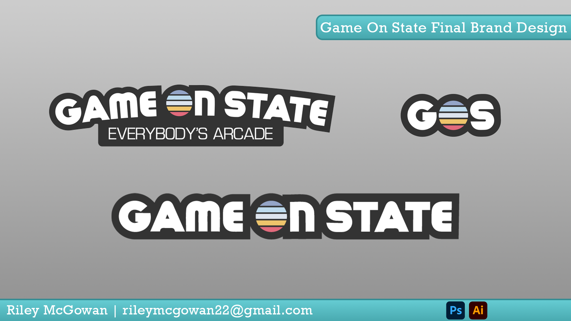
This is the final brand design that we landed on, which can be seen across all of Game on State’s branding, signage, etc. The font was chosen to be fun and nostalgic, with the pastel O to symbolize the candy aspect of the store.
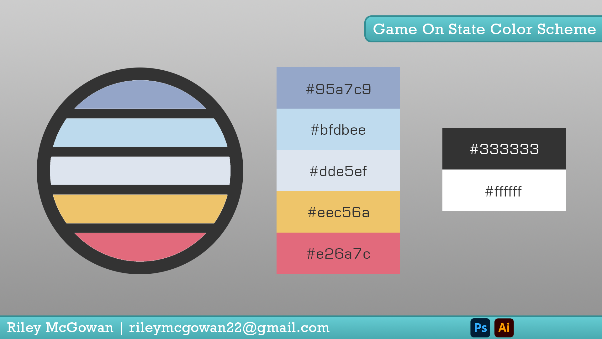
This is the final color scheme chosen for the store, which went through multiple revisions, to ensure that the colors were fun, lighthearted and all went well together.
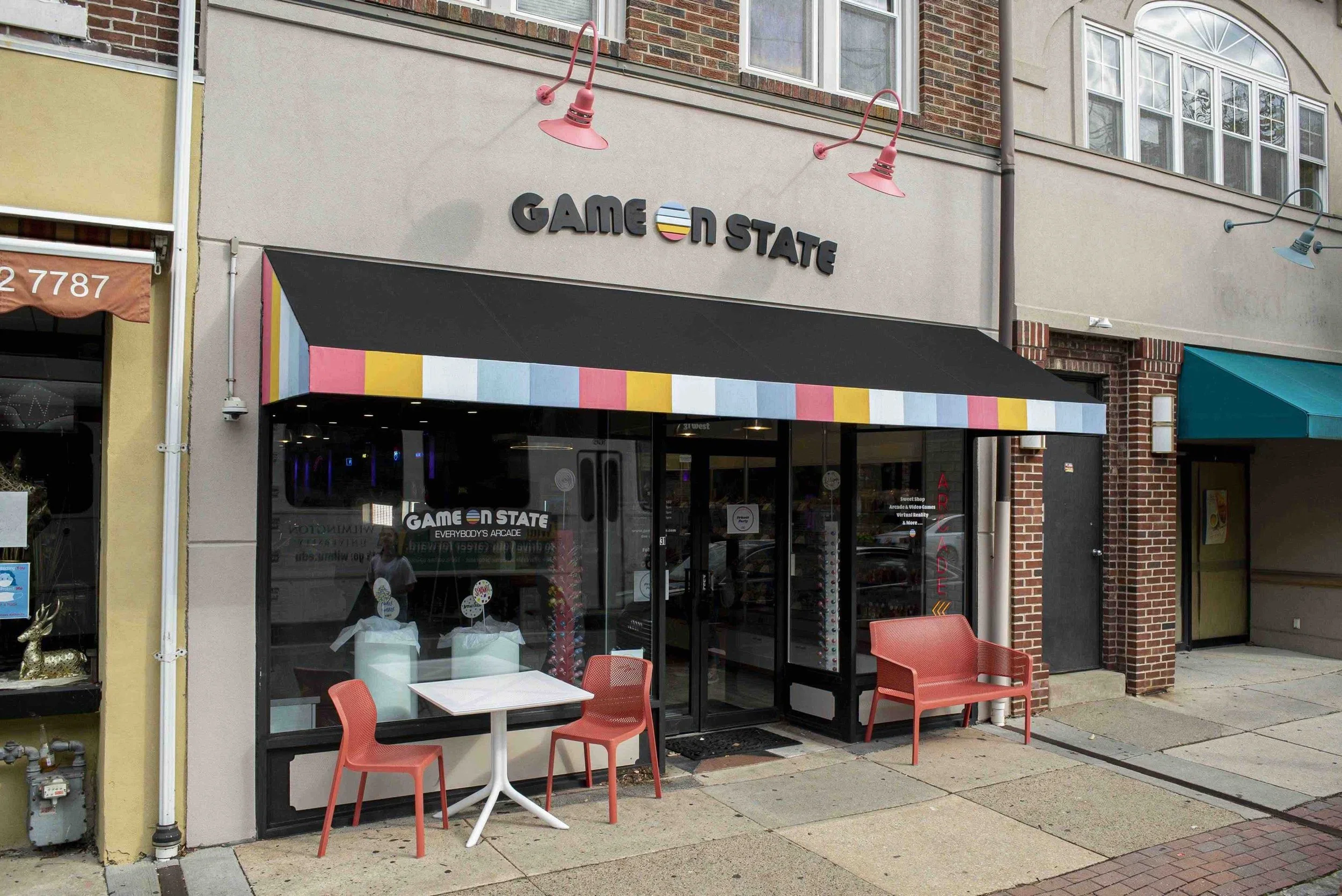
This is the storefront of Game on State in Media, PA, with the logo and color scheme that we designed.